How Color Grading Makes AI Anime Look Professional (Cinematic Prompt Guide)
The palette language that separates a flat AI anime output from one that looks like it belongs in a theatrical release.
Color grading is the last mile of visual craft that most people skip in their AI anime prompts. The character is right, the composition is right, the lighting is right, and the output still looks flat, generic, and slightly clinical compared to the reference scenes that inspired it. The difference is almost always palette. Professional anime productions and theatrical films apply a deliberate color grade after everything else is done, which shifts the image toward a specific emotional key. That grade is a creative decision, not a technical afterthought, and it can be specified directly in an AI prompt. This guide covers seven color grading approaches, explains what each one does to a scene's emotional register, and provides the exact prompt language to produce each one reliably.
Why color grading changes emotional tone, not just appearance.
Color grading works on two levels simultaneously: physical and psychological. On the physical level, a grade shifts the hue and saturation relationships between the elements in a scene, which changes how the eye reads depth, separation between subjects, and the time of day implied by the light. On the psychological level, humans have deeply wired associations between specific palettes and emotional states. Warm amber tones read as safety, intimacy, and memory. Cool blue-green tones read as distance, unease, or clinical detachment. High saturation reads as heightened emotion, elevated stakes, or genre convention. Muted desaturation reads as realism, weight, and restraint.
When an AI model receives a prompt with no color grading instruction, it generates something tonally neutral: the color temperature of the scene is determined by the implied light source, the saturation is averaged toward its training data, and the result tends to look competent but emotionally uncommitted. Adding a color grade instruction is not decoration. It's telling the model which emotional register the scene belongs in, and the model uses that information to make hundreds of small decisions about hue, shadow color, highlight temperature, and mid-tone bias that would otherwise default to the mean.
The other reason color grading improves perceived quality is genre coherence. When you describe a "muted cinematic grade with cool shadows and slightly lifted blacks," you're invoking a post-production convention that the model associates with prestige productions. The output inherits the visual vocabulary of that tradition. The same scene without that instruction looks self-generated. With it, it looks like something that was made with intention.
Pastel tones: the grade for warmth, softness, and emotional safety.
Pastel tones are the signature palette of slice-of-life anime, school romance arcs, and any scene where the emotional register is gentle, intimate, or idealized. The grade works by desaturating colors toward white rather than toward gray: instead of vivid red, you get soft rose; instead of deep green, you get sage; instead of saturated blue sky, you get a washed pale cerulean. The shadows are never truly dark, and the highlights are clean rather than harsh. The overall effect is a scene that feels slightly lit from within, as if everything is at its most forgiving and soft.
The prompting error with pastels is asking for them too vaguely. "Pastel color scheme" might produce something accurate, but it doesn't tell the model whether you want the warmth biased toward peachy skin tones, whether the sky should be pale blue or pale lavender, or whether the shadows should stay warm or go slightly cool. Specificity produces a better result.
Soft pastel daylight scene: pastel color grade, soft rose and sage and pale cerulean tones throughout, the light warm and diffused as if filtered through gauze, skin tones shifted toward peachy warmth, shadows lifted and tinted slightly lavender rather than gray, the sky a clean pale blue with no deep saturation, all colors at roughly sixty percent saturation giving the whole scene a gentle washed clarity.
Pastel grades work well with cherry blossom scenes, morning classroom light, summer picnics, and any scene where nostalgia and youth overlap. They do not work for scenes with dramatic stakes or physical tension, because the palette communicates safety and the genre conventions of those scenes communicate threat. If the emotional register is mixed, the grade has to resolve the conflict.
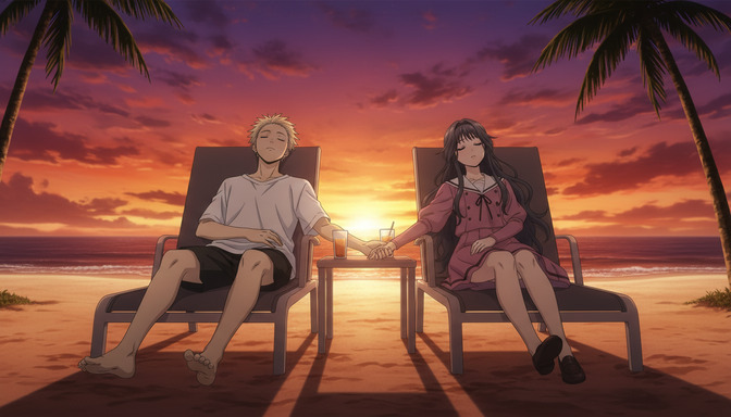
Teal-orange: the cinematic grade that signals production value immediately.
Teal-orange is the most widely used color grade in contemporary cinema and one of the most effective grades to apply to AI anime for immediate perceived quality improvement. It works by pushing the shadows and cool mid-tones toward teal or blue-green while pushing skin tones, warm surfaces, and highlights toward amber-orange. Because human skin sits naturally in the orange-amber range, and because teal is the complementary color to orange on the color wheel, the two hues create maximum separation between characters and backgrounds. Characters stand out from environments without any compositional change, and the contrast creates a visual tension that reads as cinematic even in a static image.
The reason teal-orange has become ubiquitous in blockbuster films is the same reason it works in AI anime: it makes everything look like it was lit by a professional gaffer. The warm tones say "practical light source, intentional warmth." The cool shadows say "fill light is carefully balanced, not ambient." Even in an outdoor anime scene where neither of those things is literally true, the grade implies the craft behind them.
Teal-orange sunset scene: teal-orange color grade, warm amber-orange in the highlights and sky, the sand and any direct light sources glowing golden-amber, the shadows in the foreground and darker background areas shifted toward deep teal-green, skin tones warm and slightly golden, the ocean and the lower sky grading from amber at the horizon toward cooler teal overhead, the grade producing a strong warm-cool separation that makes the figures pop against the environment.
For action and drama scenes, teal-orange is nearly always the correct choice. For romantic and intimate scenes, it adds a cinematic quality while keeping warmth in the character tones. The one context where it works less well is monochromatic or specifically stylized scenes where teal and orange would compete with the intended palette rather than shape it.
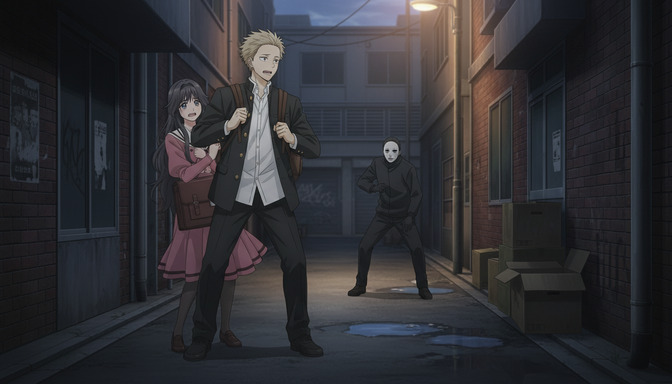
Muted cinematic: pull the saturation back and the story comes forward.
Muted cinematic is the color grade associated with prestige animation and live-action drama: lower saturation across the whole palette, slightly lifted blacks so the shadows are dark gray rather than pure black, cooler overall temperature that keeps the scene from feeling warm or safe, and a subtle grain or texture in the mid-tones that suggests analog film stock. The result looks expensive, restrained, and weighted. It's the grade for stories that take themselves seriously.
This grade is often confused with desaturation, which just drains color uniformly and produces something flat. Muted cinematic desaturates selectively: warm highlights retain more saturation than mid-tones, which retain more than cool shadows. The blacks are lifted, which compresses the tonal range and removes the pure-black areas that make an image look either very cheap or very stylized. The overall effect is dimensional and intentional, not washed out.
Muted cinematic drama scene: muted cinematic color grade, overall saturation pulled to about forty percent of natural, the blacks lifted slightly so the deepest shadows are dark gray rather than pure black, the ambient color temperature slightly cool and blue-gray, warm elements like skin and any light sources retaining more saturation than the surrounding environment, a subtle fine film grain present in the mid-tones, the grade giving the scene the tonal restraint of a prestige animation production rather than the vivid clarity of commercial anime.
Muted cinematic is the correct grade for scenes involving grief, moral weight, warfare, adult conflict, or any emotional register that requires the viewer to feel the scene's gravity before its beauty. It can also work in urban mystery settings where a vivid palette would undercut the noir atmosphere.
High saturation: when the world is supposed to feel bigger than real life.
High saturation is the grade of shonen battle scenes, magical girl transformations, tournament arcs, and any moment where the anime is explicitly operating in a heightened register. Colors are pushed toward their most vivid, most saturated expressions: the sky is a deep electric blue, the grass is a rich emerald, the fire is pure orange-red with no desaturation in its edges, the character's aura is whatever color it's supposed to be at full intensity. The grade signals that the rules of the normal world have been temporarily suspended in favor of a more charged, more operatic reality.
The failure mode is applying high saturation uniformly without considering what different hues do at maximum intensity. Skin at very high saturation goes unnatural: it reads as either a color comp artifact or deliberate stylization toward a specific art style (like Trigger's hyper-stylized aesthetic). The correct approach to high saturation is to saturate the environmental and atmospheric elements aggressively while keeping skin tones slightly restrained, or to pick a specific style reference that provides cover for fully saturated characters.
High saturation action scene: high saturation color grade, the sky a deep vivid blue pushed to near-maximum intensity, the character's energy aura a fully saturated golden-yellow with no desaturation at the edges, the ground and environment in rich vivid greens and browns pushed well above natural saturation, skin tones at heightened warmth but not pushed to full orange to avoid artifacting, the overall palette communicating the heightened register of a decisive battle moment rather than naturalistic observation.
Monochrome: strip the color and the composition has nowhere to hide.
Monochrome in anime prompts is not "just make it black and white." A true monochrome grade preserves all the luminance information of the scene, which means the quality of the composition, lighting, and form has to do all the work that color normally assists. Shadows have to be interesting shapes. Highlights have to define volume. The mid-tones have to be specific rather than averaged. Monochrome rewards well-composed scenes and brutally exposes poorly composed ones.
For AI anime specifically, monochrome prompts produce some of the most striking outputs when combined with strong directional lighting: a single hard light source casting well-defined shadows, a character lit from below or from the side, or a scene with deep foreground-background separation in tonal value. The grade is associated with historical drama, samurai stories, expressive art-house animation, and any context where formalism and emotional weight take precedence over visual warmth.
Monochrome noir scene: full monochrome grade, all color removed leaving the luminance channel as the only information source, high contrast between deep near-black shadows and bright highlights, the character lit from a single strong lateral light source with one side of the face bright and the other in deep shadow, the background darker than the figure so the silhouette remains legible, the grade conveying the formalism and weight of classic noir rather than a digital conversion artifact.
For a partial monochrome effect, a selective de-saturation that leaves one color element fully saturated while the rest of the scene is in grayscale, specify the single retained color explicitly: monochrome grade with only the character's red scarf remaining in full color, everything else desaturated to deep graphite and silver, the saturated red reading as the only warm point in an otherwise cold scene.
Vaporwave: a palette that carries its own genre, era, and emotional register.
Vaporwave as a color grade is specific: deep magenta, electric blue, soft purple, neon pink, and cyan operating at high saturation against dark backgrounds. The light sources are always neon or synthetic, never natural, which means there are no warm amber tones from the sun, only the cool-to-warm spectrum of artificial lights glowing through a layer of slight haze. The palette reads as retrofuturist: it belongs to an imagined 1990s digital aesthetic that never quite existed, which gives it a specific kind of nostalgia for something slightly unreal.
For AI anime, vaporwave grades work extremely well for cyberpunk and synthwave settings, late-night city scenes, arcade environments, VR or digital world sequences, and any scene that should feel like it exists in a mediated or slightly hyperreal space. The grade immediately communicates genre to anyone familiar with it, and even to those who aren't it reads as stylized, intentional, and visually distinctive.
Vaporwave city scene: vaporwave color grade, deep magenta and electric blue as the dominant tones, neon pink and cyan as accent sources from signs and lights, the ambient light in the scene a soft purple-lavender rather than white or warm, all natural colors shifted toward the cooler pink-blue-purple range, the shadows a deep rich blue-black rather than neutral gray, the grade producing the synthwave-cyberpunk aesthetic of 1990s retrofuturist digital imagery.
Nostalgic warmth: when the scene is supposed to feel like a memory.
Nostalgic warmth is technically a specific application of warm color grading, but its emotional target is distinct enough to treat separately. The grade pushes all mid-tones and shadows toward amber, gold, and slightly faded yellow, as if the image has been processed through aging analog film stock or late afternoon summer light. Contrast is slightly lower than natural. Highlights are warm and slightly blown. The colors are not fully saturated, but the warmth is consistent throughout the frame, so even the cool shadows have a golden-amber halo from the ambient light's dominance.
This is the grade for flashback sequences, childhood memory scenes, summer festival nights, and any moment where the story is explicitly asking the viewer to feel the ache of something that has passed or is passing. The palette does not require the narrative context to work: even a scene with no explicit temporal framing will read as elegiac and softly nostalgic under this grade because of the deep association between amber film aesthetics and memory.
Nostalgic summer evening scene: nostalgic warmth color grade, all mid-tones shifted toward amber-gold as if shot on warm analog film stock, the shadows a deep warm brown rather than cool gray, highlights slightly warm and softly blown without hard edges, the overall contrast slightly flatter than natural, skin tones glowing with warm amber light from a late summer sun, the entire palette communicating the specific bittersweet quality of a moment being experienced while already aware of its ending.
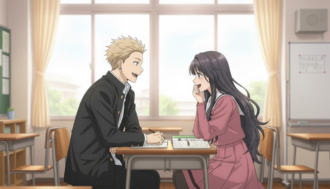
Stacking a color grade with other prompt layers.
Color grading works best as the final layer of a fully built prompt, not the starting point. Specify the subject, lighting, composition, and atmospheric elements first, then close the prompt with the color grade instruction. The grade operates on top of everything else: it shifts the palette of whatever scene has been described, rather than defining the scene itself. A teal-orange grade applied to a scene with dramatic hard lighting produces something different from the same grade applied to a diffused overcast scene, because the grade interacts with the light physics that were already established.
Combining a grade with an explicit style reference multiplies the effect. A muted cinematic grade combined with a Makoto Shinkai style reference will produce something that looks like it belongs in a Shinkai film, because both instructions are biasing the output toward the same visual tradition. A vaporwave grade combined with a cyberpunk setting and neon lighting creates three layers of genre coherence rather than one. The specificity compounds.
Combined example: a woman standing on a rain-wet rooftop overlooking a neon-lit city at night, shot from below looking up, the city lights reflecting in the pooled water around her feet, her jacket pressed back by the wind, teal-orange color grade with the neon reflections in the puddles glowing warm amber against the cooler teal of the surrounding shadows, mist in the mid-distance softening the city background into an indistinct glow, the grade and the neon working together to produce a cinematic cyberpunk night.
For the complete architecture of how color grading fits alongside subject, composition, lighting, camera, and emotion in a layered prompt, the guide on the ultimate AI anime prompt formula covers all seven layers in order. Color grading interacts closely with lighting, and the guide on AI anime lighting prompts explains how light temperature and source type establish the base that a color grade then modifies.
Frequently asked questions about color grading in AI anime prompts.
What is the easiest color grade to add to an AI anime prompt for immediate quality improvement?
Teal-orange is the fastest single change that produces visible quality improvement across the widest range of scenes. The grade does not require specific lighting conditions to work, it enhances most scene types including action, romance, and urban environments, and it creates the immediate impression of cinematic production value because of its association with prestige cinema. Add it as a single phrase at the end of an existing prompt: "teal-orange color grade, warm amber highlights and cool teal shadows." That instruction alone will shift an average output toward something that reads as intentional and polished.
How is muted cinematic different from just desaturating a scene?
Uniform desaturation removes color evenly, which flattens the image and eliminates the hue contrasts that give the scene visual interest. Muted cinematic is a selective and structured process: it reduces overall saturation but retains relative relationships between warm and cool tones, lifts the blacks slightly to compress the tonal range and give shadows a dimensional dark-gray quality rather than pure black, and preserves more saturation in warm highlights and skin tones than in cool mid-tones and backgrounds. The result is a restrained, weighted palette that still reads as intentional and crafted rather than processed. The tell is in the shadows: desaturation produces gray shadows, muted cinematic produces dimensional dark shadows with subtle hue bias.
Can I combine two color grades in the same prompt?
Yes, but the grades need to be compatible rather than contradictory. Nostalgic warmth and pastel tones combine well because both bias toward soft, warm, slightly desaturated palettes. Muted cinematic and teal-orange combine well because the muted grade controls overall saturation while teal-orange controls the warm-cool separation. High saturation and monochrome are contradictory: one maximizes color intensity, the other removes color entirely. When combining grades, specify which elements each grade applies to, or specify one grade as dominant and the other as modifying: "muted cinematic base grade with teal-orange warm-cool separation in the highlights and shadows."
Does color grading work differently for AI anime video prompts in Seedance 2?
In Seedance 2 video prompts, a color grade instruction applies to the entire clip rather than a single frame, which has two implications. First, the grade remains consistent through the animation, which is what you want: a teal-orange grade should not drift to neutral as the scene progresses. Second, if the scene includes a light source that changes during the clip, the grade interacts with that change. A nostalgic warmth grade combined with a sunset that deepens during the shot will produce a beautiful compounding effect as the natural warmth of the sunset amplifies the grade. Specify the grade at the beginning of the prompt and include any temporal lighting changes as part of the scene description so the model can animate both together.
Why does my pastel grade keep looking washed out instead of soft?
The difference between washed out and soft is contrast. Washed out means contrast has been reduced without the underlying composition having strong enough tonal separation to survive that reduction. Soft means the same reduced contrast applied to a scene with well-defined mid-tones, clear subject-background separation, and sufficient light to keep the pale palette luminous rather than murky. For pastel prompts, start by ensuring the lighting is bright and clean: diffused natural daylight, soft overcast light, or warm indoor light that has enough intensity to keep shadows lifted and surfaces glowing. A dim scene with a pastel grade will go muddy. A well-lit scene with a pastel grade will go soft and clear.
What color grade is best for anime scenes set at night?
The best grade for night scenes depends on the emotional register of the scene. Urban thriller or mystery: muted cinematic with cool blue-gray ambient, isolated warm light sources, deep-lifted shadows. Romantic night scene: nostalgic warmth applied to the light sources (lanterns, candles, neon) while keeping the ambient cool, creating a warm-cool tension that reads as intimate. Cyberpunk or vaporwave night: full vaporwave grade with magenta and cyan neon against deep blue-black backgrounds. Action or combat night: teal-orange with the teal pushed into the dark ambient and the orange concentrated in fire, explosions, or energy effects. Each grade produces a night that belongs to a different genre and a different emotional register, which is why specifying the grade is more useful than describing a night scene without palette instruction.
How do I prompt a vaporwave aesthetic without it looking like a wallpaper?
The wallpaper problem comes from applying the vaporwave palette to a scene without a strong narrative or character anchor. A vaporwave cityscape with no figures is a wallpaper. A vaporwave cityscape with a specific character in a specific emotional state is a scene. The fix is to build the vaporwave grade into a fully specified prompt: the character's position, posture, and expression; the environmental detail that makes the setting specific rather than generic; and the lighting behavior that grounds the neon in physical sources. Specify the light sources that are producing the neon (a sign, a screen, a holographic display), because a vaporwave grade that has no visible neon source looks like a filter rather than an environment. The grade should emerge from the scene's lighting logic, not be applied over an empty background.
Color grading is the palette-level decision that determines which emotional tradition a scene belongs to. Atmosphere describes what's in the air; lighting describes where the shadows fall; color grading describes the tonal register that sits underneath both of those. For building the character at the center of all these graded scenes, the AutoWeeb character creator lets you design a consistent character who carries across every palette you put them in. For the full layered prompting system that places color grading alongside every other element, the guide on adding atmosphere to AI anime prompts covers the environmental layer that interacts directly with your color grade.